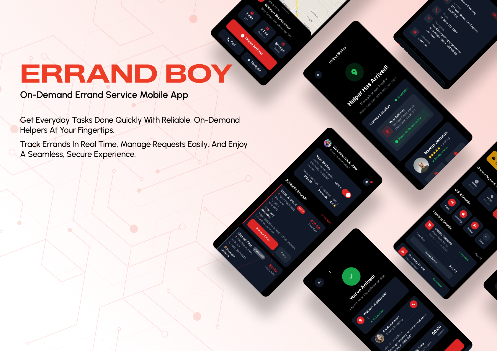
Errand Boy is presented here using the original exported UI screens and custom mockups you uploaded. The case study highlights both the dark mobile product experience and the operations-heavy dashboard/admin surface without altering the underlying UI.
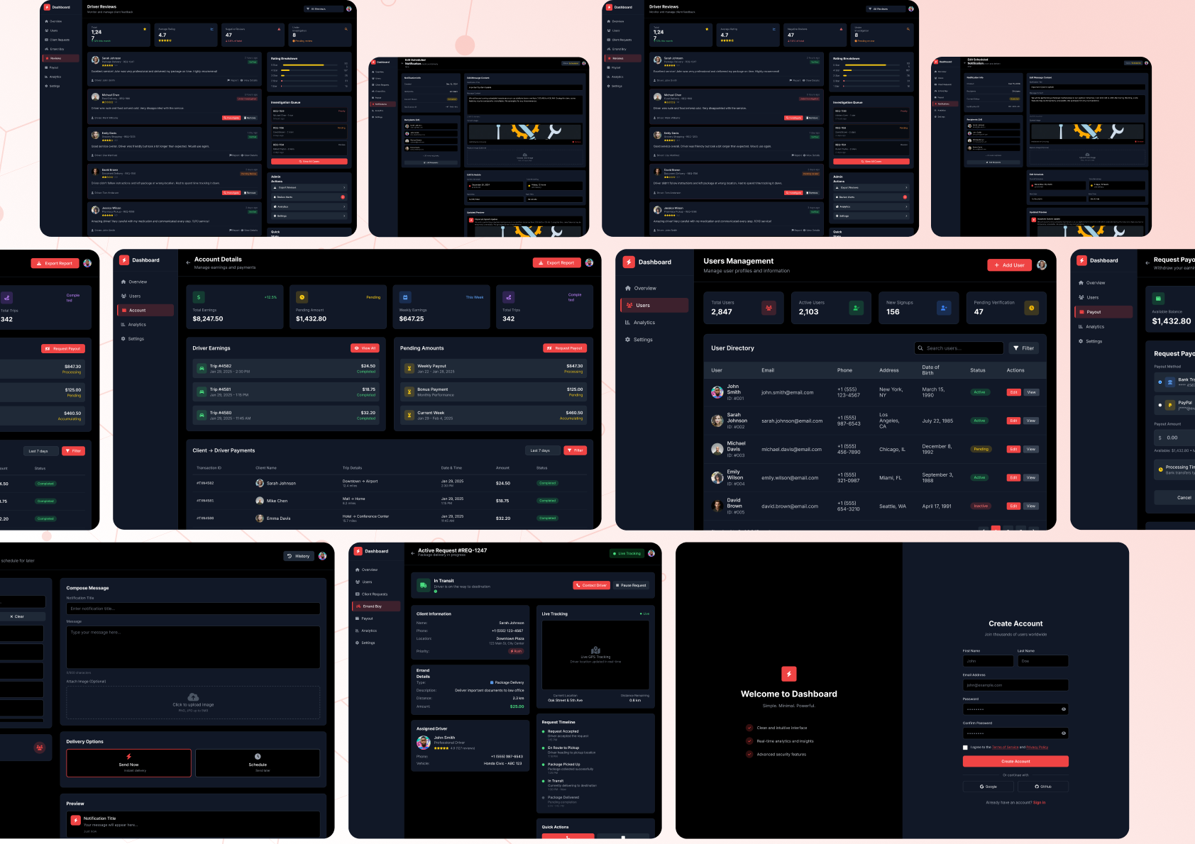
The admin surface is presented as a wide, information-rich composition covering reviews, account details, user management, request payouts, messaging, live tracking, and authentication states.
Dashboard and operations ecosystem
02
Mobile Product Flow
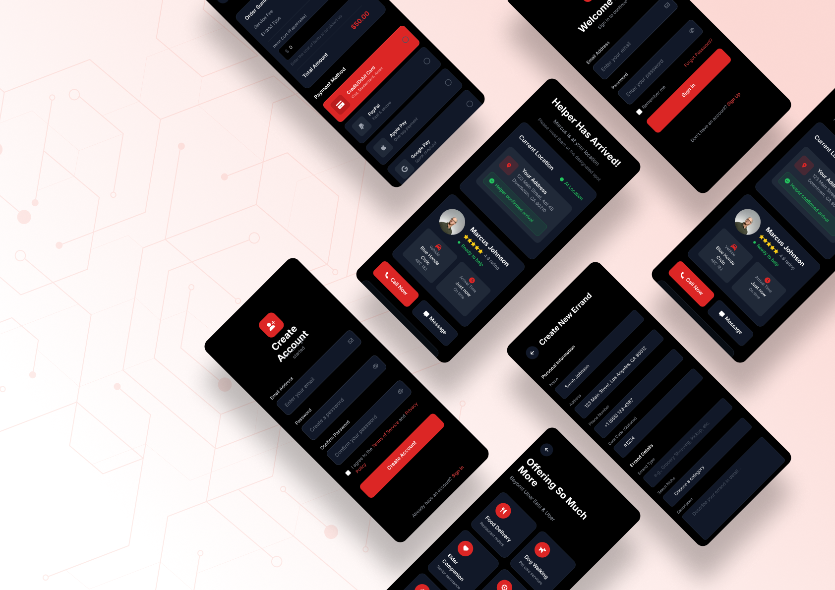
Core mobile product states are shown through the original collage, covering account creation, helper arrival, payment, new errand creation, and service-category entry points.
Mobile screen showcase
01
Project Overview
Errand Boy is an on-demand errand service product with a dark, high-contrast visual system that spans customer flows, helper states, payout tooling, communication, and admin dashboards.
02
Project Goals
Design an end-to-end service ecosystem that makes real-time errand management legible for all sides of the platform, from customer requests and helper progress to admin oversight and analytics.
03
Problem Statement
On-demand errand products involve many fast-moving states — request intake, helper availability, navigation, arrival, payout, messaging, and dashboard control. Without strong hierarchy, the experience becomes visually noisy and operationally difficult.
04
Design Challenge
Unify a feature-heavy ecosystem across mobile and desktop while maintaining urgency, clarity, and brand personality. The product had to feel active and responsive without sacrificing readability.
05
Solution
A bold dark UI built around strong card separation, vivid action colors, and modular information blocks. Critical actions are visually prioritized, while supporting details live in repeatable card structures that scale across many screens.
06
Design Process
The presentation uses your own custom mockups for hero storytelling and pairs them with structured dashboard and screen-collage layouts to show system breadth. This keeps the visual narrative premium while preserving the exact original UI.
07
User Flow
The uploaded screens show a full operational flow: dashboard monitoring, user management, request details, payout handling, notifications, helper states, account creation, and delivery orchestration.
08
Typography
Compact UI typography with strong weight contrast supports dense operational screens, financial summaries, tables, and status-driven cards.
09
Color Palette
Near-black surfaces with vivid red, green, yellow, and blue states create urgency and fast recognition across requests, payouts, and live task management.
10
Design System
Shared card modules, side navigation patterns, summary stat tiles, form surfaces, and status chips create a consistent system across both mobile and admin contexts.
11
Components
Request cards, live status modules, financial summaries, user tables, message composers, tracking panels, profile summaries, and payout cards are repeated across the product.
12
Feature Highlights
Errand request tracking · Live helper states · Payout flows · User management · Notifications · Analytics · Delivery orchestration · Admin settings.
13
UI Showcase
The case study highlights both management-heavy dashboard views and customer/helper-facing mobile experiences, giving the product a full ecosystem presentation.
14
Mobile Mockups
Your existing custom device mockups are used directly for the mobile experience instead of replacing them with synthetic frames.
15
Desktop Mockups
Wide dashboard compositions are preserved to show information density and operator workflows in their intended presentation format.
16
Results
The uploaded case-study assets reveal a mature multi-surface system spanning logistics, account management, finance, and communication without losing visual cohesion.
17
Final Results
A high-intensity, feature-rich service product that still feels structured and navigable thanks to consistent modules and deliberate visual priority.
18
Project Conclusion
Errand Boy demonstrates how a dark operational product can stay clear, premium, and highly actionable. Every uploaded Errand Boy asset is incorporated into the case study presentation.
19
Key Takeaways
Dense logistics products need clear color logic, repeatable modules, and ruthless visual prioritization to remain usable under pressure.