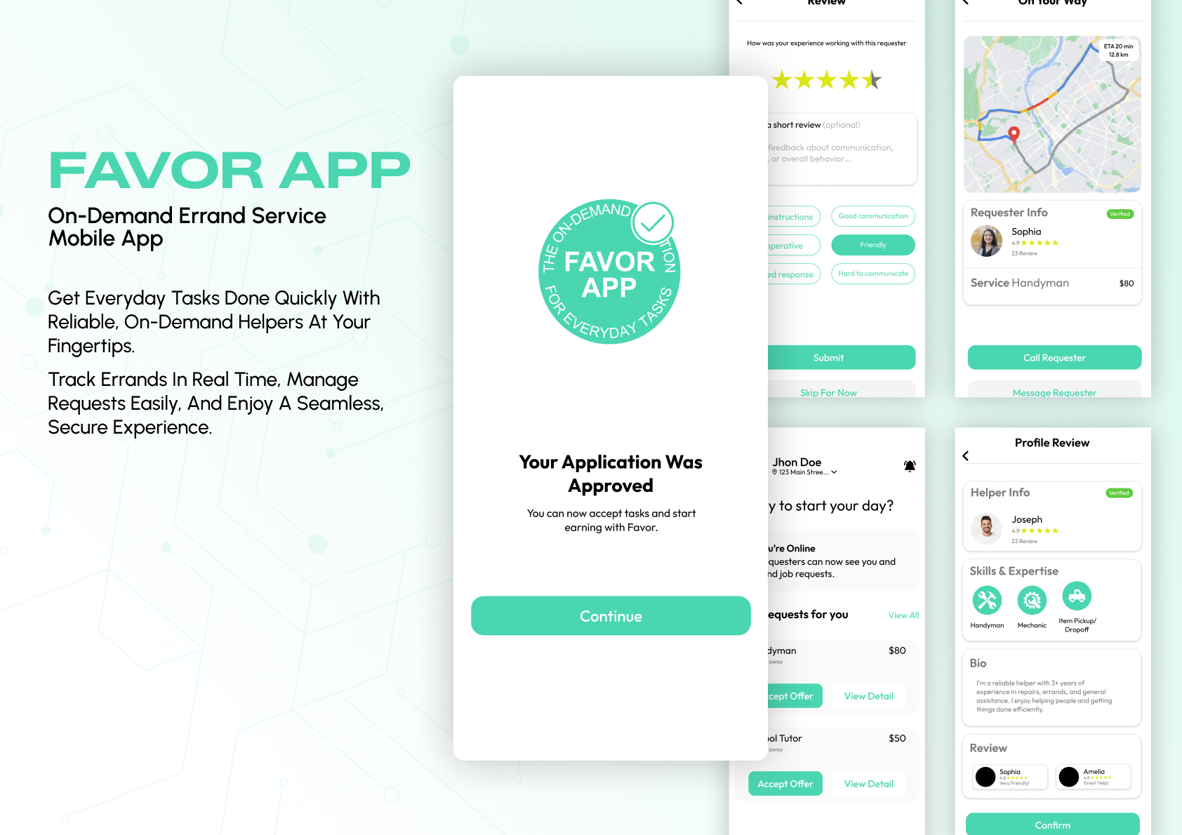
Favor App is a service marketplace product presented using the original exported UI screens and custom mockups. The case study combines the mobile product experience with the wider platform surface, including dashboard and workflow screens, while preserving the original interface exactly as designed.
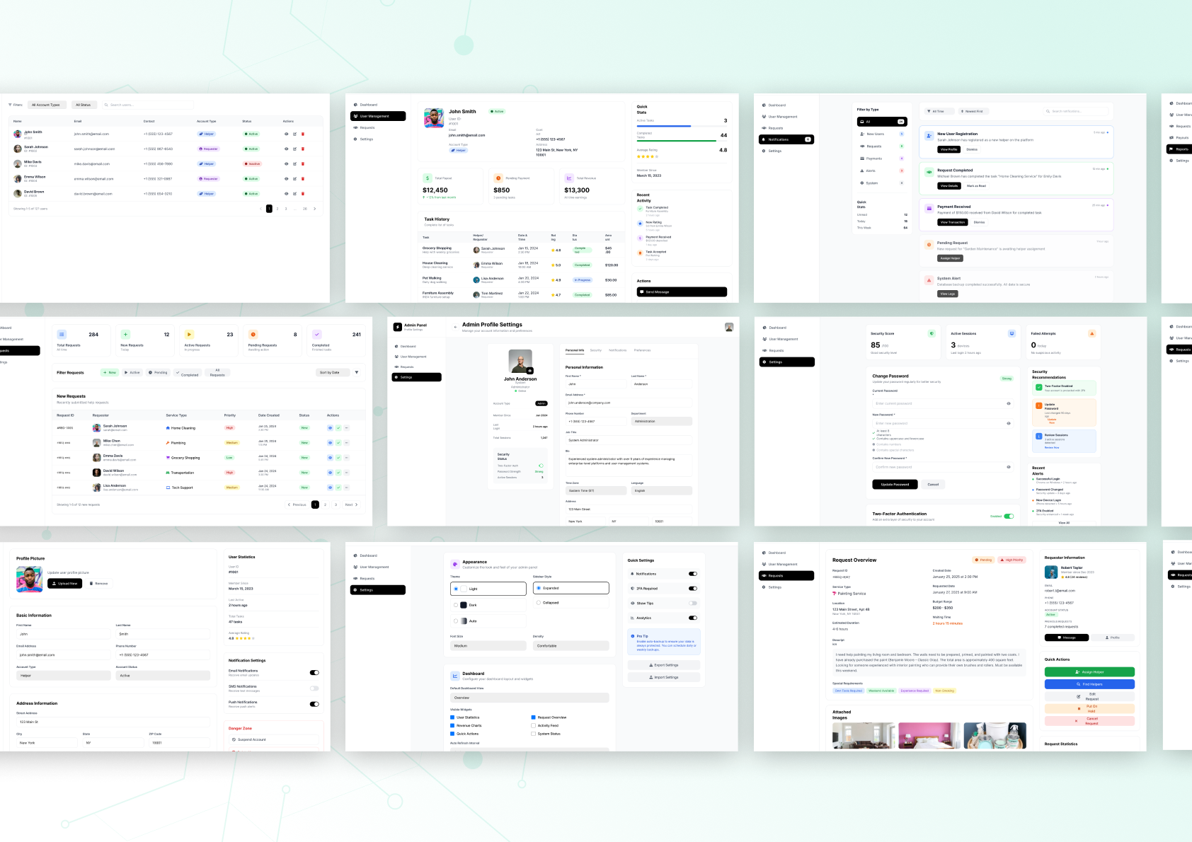
Dashboard and supporting platform screens are presented in a wide editorial composition to show how the product scales beyond the mobile experience.
Supporting platform and dashboard views
02
Mobile Experience
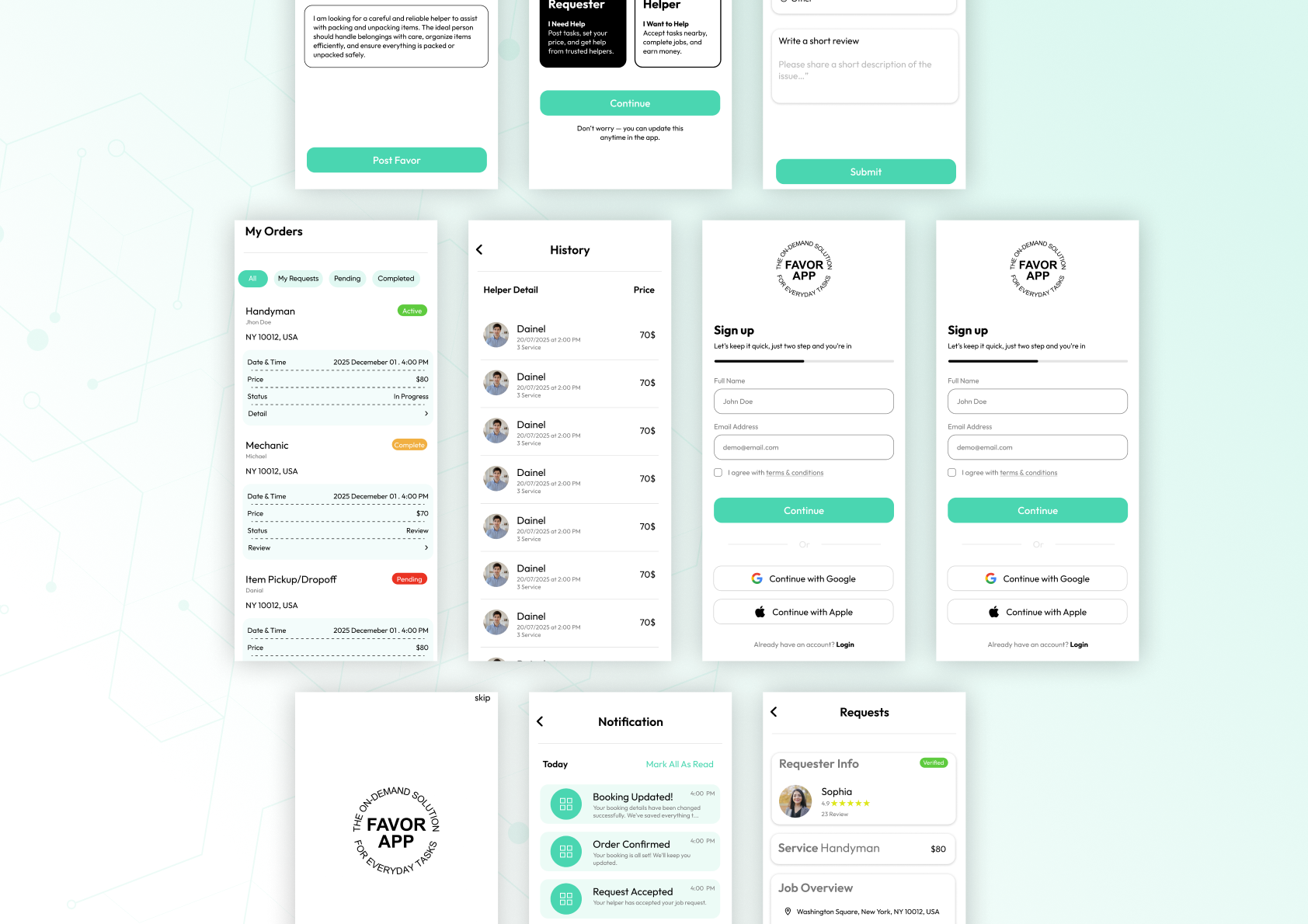
Key mobile product states are arranged in a clean visual flow, from onboarding and request history to notifications and active task views.
Mobile UI showcase
01
Project Overview
Favor App is an on-demand everyday task platform that connects requesters with helpers through a clean, approachable mobile interface. The uploaded presentation assets show the product across onboarding, approvals, requests, profile states, notifications, and supporting platform surfaces.
02
Project Goals
Create a trustworthy, easy-to-understand mobile experience for booking and managing favors while keeping the product lightweight, fast, and visually calm. Support both the service-request journey and the supporting operational surfaces around it.
03
Problem Statement
Task-based service products often feel transactional, dense, and difficult to trust. Users need clarity around approvals, order states, helper profiles, histories, and communication without losing momentum inside the booking flow.
04
Design Challenge
Balance warmth and clarity in a service marketplace UI while accommodating many states: approvals, requests, reviews, helper profiles, onboarding, notifications, and order management. The experience needed to stay visually consistent from first-time setup to active task tracking.
05
Solution
A soft, friendly visual language with strong hierarchy, rounded UI surfaces, and focused CTAs. The system uses repetition, generous spacing, and consistent component behavior so multi-step flows feel intuitive rather than operationally heavy.
06
Design Process
The case study flow is organized from branded hero presentation into detailed mobile product views and then supporting platform surfaces. Existing custom mockups are used wherever available to preserve the original presentation quality of the exported work.
07
Typography
Clean geometric UI typography supports easy scanning across approvals, requests, and transactional content while still feeling approachable and product-led.
08
Color Palette
A mint-led accent palette sits on bright, airy neutrals to create trust and softness. Accent color is used intentionally for approvals, CTAs, and confirmation moments.
09
Design System
The UI relies on reusable cards, form fields, segmented tabs, profile summaries, and status treatments to keep the experience cohesive across many product states.
10
Components
Approval cards, request summaries, profile headers, status pills, rating modules, notification rows, order history cards, and simple action bars form the backbone of the product UI.
11
Feature Highlights
Requester onboarding · Helper approval flow · Notifications · Order history · Request management · Profile review · Service tracking · Rating and review surfaces.
12
UI Showcase
The uploaded screens demonstrate the core product experience across approvals, order history, notifications, requests, profile review, onboarding, and helper-facing states.
13
Mobile Mockups
Custom mobile mockups provided in the uploaded assets are used directly instead of replacing them with generated device frames.
14
Desktop Mockups
Dashboard and platform-support views are showcased through the uploaded wide-layout compositions to maintain the original designer presentation.
15
Results
The presentation demonstrates a mature multi-surface product system with consistent components, clear call-to-actions, and polished mockup storytelling across both mobile and dashboard views.
16
Final Results
A premium, cohesive service product presentation that shows both the emotional product layer and the functional management layer without redesigning the original UI.
17
Project Conclusion
Favor App combines warmth and operational clarity, making a complex service marketplace feel approachable. The case study uses every uploaded Favor asset to present the work as a complete product story.
18
Key Takeaways
Friendly service products benefit from clarity-first hierarchy, repeated component patterns, and gentle branding that builds trust without slowing users down.